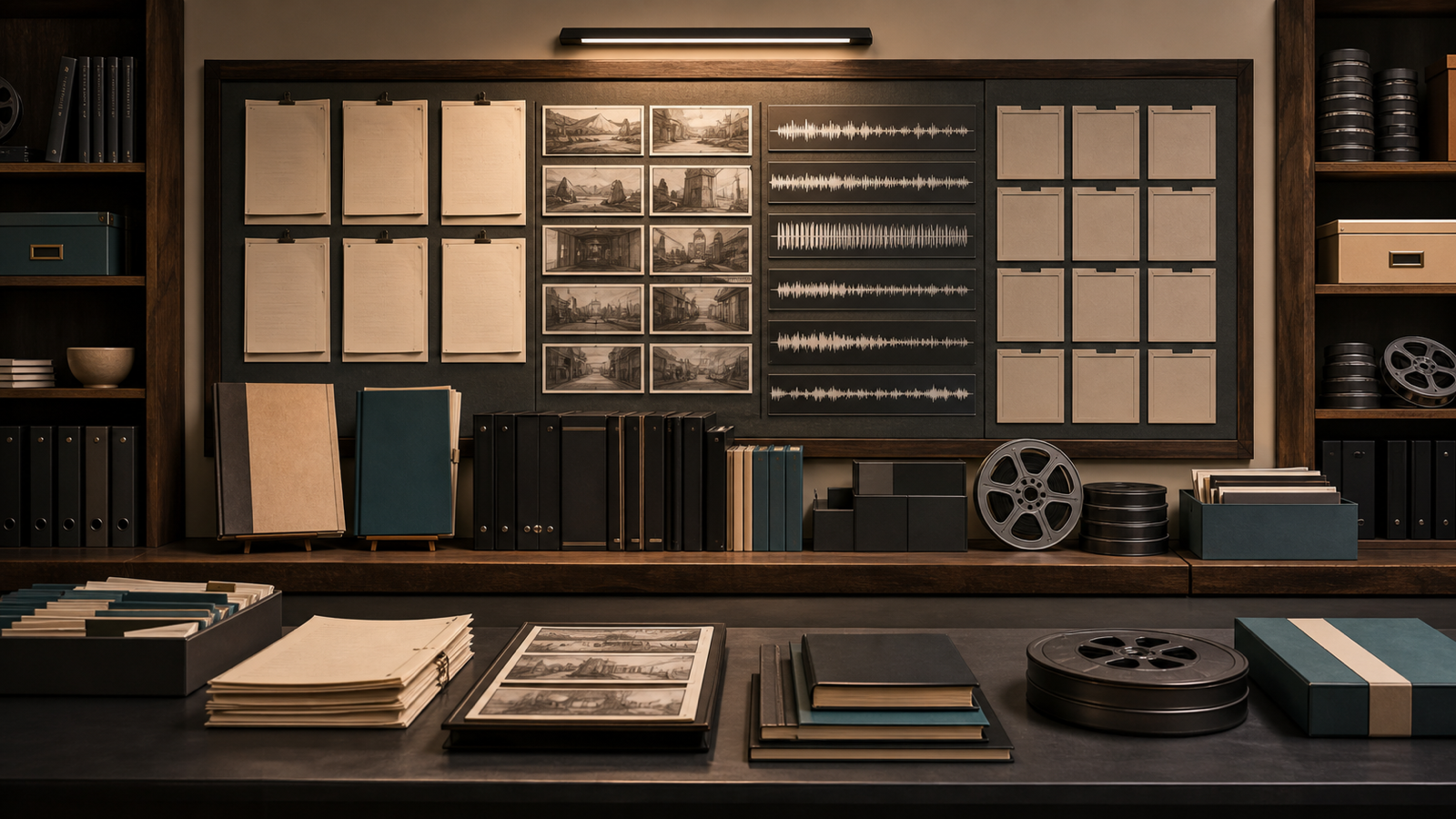
AI Visuals for Digital Products Without Generic Mockups
Replace generic laptop mockups with product-specific visual metaphors, destination-aware composition, and a strict acceptance process.

The fastest way to make an AI product look like every other AI product is to place a dashboard on a floating laptop, add a purple glow, and call it a hero image.
Nothing is technically wrong with that composition. It is simply unable to explain anything specific.
A publishing workflow, audiobook system, music toolkit, video pipeline, and agent builder should not share the same visual metaphor just because they are digital products.
The image should reveal the work, not merely prove that a screen exists.
Replace the device with the artifact
Begin with the object the buyer is trying to create.
- A publishing product can show manuscript pages becoming distinct ebook and print packages.
- An audiobook product can show a pronunciation sheet, segmented waveform, pickup markers, and finished chapter files.
- A music workflow can show a sonic brief feeding controlled candidates and one selected arrangement.
- A video pipeline can show a brief, shot cards, narration, timeline, captions, and master render.
- An agent product can show evidence entering a bounded task and stopping at an approval gate.
These are visual metaphors, but they are grounded in actual workflow artifacts.
The viewer should understand the category before reading the product name.
Find the sentence the image must prove
Every image needs a visual thesis.
Weak brief: “Create a premium image for an AI video course.”
Stronger brief: “Show a one-page brief becoming an ordered set of frames, narration, captions, and a finished video, with every stage visibly connected.”
The second brief gives the model relationships to render. It also gives the reviewer a reason to reject an attractive image that fails the product story.
Use concrete objects
Generic mockups rely on atmosphere because the objects say very little.
Product-specific visuals rely on a small set of recognizable things:
| Workflow idea | Useful objects | Avoid |
|---|---|---|
| Structure | Ordered cards, chapter sheets, linked stages | Random floating cubes |
| Review | Check marks, side-by-side versions, visible notes | A vague glowing shield |
| Downloads | Folders, worksheets, templates, file stacks | One unexplained download arrow |
| Narration | Script segments, waveform, pickup flags | Generic microphone portrait |
| Automation | Evidence cards, tool boundary, approval stop | Humanoid robot at a desk |
The goal is not literal diagramming in every image. It is enough specificity that the metaphor belongs to this product.
Give each product one visual verb
Static object piles quickly become cluttered. A verb creates a scene.
The Book Factory assembles. The KDP Playbook packages. The Audiobook Toolkit aligns. The Music Toolkit directs. The Video Toolkit sequences. The Agents Toolkit gates. Ship After 5 reduces.
That verb should shape the action, composition, and object hierarchy.
When the model generates a creator merely smiling beside the objects, the verb has disappeared.
Keep one campaign world
Specific products still need family resemblance.
Lock the stable layer:
- warm editorial 3D illustration,
- tactile materials,
- soft directional light,
- restrained depth of field,
- the same creator character,
- warm neutral base palette,
- and product-specific accent colors.
Then vary the scene according to the product verb and artifact.
This approach avoids two extremes: seven unrelated art styles or seven copies of the same desk.
Compose for the destination
An image can be excellent and still be unusable.
A sales hero needs room for nearby copy. A Whop cover must remain legible at small tile size. A YouTube thumbnail needs a strong face or object and a short headline zone. A vertical Short needs separate space for the hook, proof image, captions, and CTA.
Write those zones into the request.
For a 9:16 visual, do not center the most important object exactly where captions will appear. For a 16:9 cover, do not spread critical objects into corners likely to be cropped by responsive containers.
The destination is part of the art direction.
Generate without typography
Required titles, numbers, and UI copy should be added after generation.
This prevents misspellings and gives one illustration several lives. The same approved master can receive a course title, article headline, or thumbnail phrase without regenerating the underlying scene.
If the model introduces accidental text, inspect it closely. Letter-like marks can look like a broken logo or foreign-language promise once the image is published.
Create a controlled candidate batch
Generate three to six candidates from the same stable direction.
Vary one factor at a time:
- camera distance,
- focal position,
- density of supporting objects,
- action moment,
- negative-space side.
Do not rewrite the entire prompt after every result. If style, subject, lighting, and composition all change together, the batch teaches you nothing about why one image worked.
Use an object hierarchy
Many generated scenes fail because every object asks for equal attention.
Define three levels:
- Primary: the one subject or artifact that carries the message.
- Secondary: two or three objects that explain the workflow.
- Atmosphere: background material that supports the visual world.
For an audiobook image, the primary object might be the aligned script and waveform. Pickup flags and chapter files are secondary. A warm studio shelf can remain atmosphere.
If the prompt lists twelve objects with equal emphasis, the model often produces a decorative inventory. Hierarchy gives the scene a sentence.
Show transformation without fake interfaces
Workflow visuals often need to show change: brief to frames, manuscript to package, evidence to approved action.
Use spatial sequence, material change, connected cards, before-and-after states, or a clear path through objects. Avoid invented dashboards filled with meaningless charts. A fake interface adds apparent precision while communicating no real operation.
If a product screen is important, capture the real screen separately and place it in a designed composition. Do not ask an image model to reproduce an interface that buyers will later compare with the product.
Maintain character continuity deliberately
A recurring creator character can humanize the campaign, but inconsistency is immediately visible.
Lock the reference image, facial structure, glasses, hair, clothing palette, and rendering style. Vary pose and action according to the asset role. Reject candidates that silently change age, body proportions, or signature details.
The character should guide attention toward the product artifact rather than replace it.
Use a reject list
Acceptance becomes easier when failure is explicit.
Reject images with:
- meaningless dashboards,
- generic neon gradients,
- accidental text,
- malformed hands or tools,
- duplicated objects,
- impossible page geometry,
- visual clutter at thumbnail size,
- the wrong product metaphor,
- inconsistent character identity,
- or no protected text area.
“Premium” and “cinematic” do not replace these checks.
Review the full set, not only favorites
Put every selected asset into one contact sheet.
Check whether the products remain distinct. Count repeated poses and desk angles. Compare palette, material, and lighting. Shrink the board until each image is close to its real card size.
An individual favorite may need to leave the set because it breaks the visual world. That is not wasted generation. It is art direction doing its job.
Preserve the decision trail
The final asset should keep its prompt version, references, dimensions, role, destination, selected candidate, and QA note in a manifest.
This is especially useful when one image later enters a video. The scene manifest should point to the approved original, not a copy downloaded from a website after compression.
When an asset fails, the trail shows whether to revise the metaphor, prompt, reference, crop, or design overlay.
Know when to stop generating
Generation can continue forever because every batch offers a plausible improvement.
Set acceptance criteria before the first candidate: the metaphor is clear, identity is consistent, focal objects are plausible, safe zones survive, dimensions are exact, and the asset works in its destination. Once a candidate passes, extra batches need a specific defect to solve.
“Maybe the next one is prettier” is not a production requirement.
Record the selected candidate and archive or clearly separate rejected outputs. Otherwise an unapproved image can return later through a familiar filename or a teammate’s download folder.
The stopping rule protects time and preserves the meaning of approval.
Respect the final design layer
Image generation should hand off to composition, not replace it.
Typography, logos, disclosure text, accessibility contrast, spacing, and export settings belong in a controlled design file or coded template. Keep those overlays editable. A campaign title or price may change after the illustration is approved.
The result can still feel integrated because the prompt reserved the required territory from the beginning.
A better test than “does it look AI?”
The useful question is not whether someone can detect the generator.
Ask whether the image explains this product, survives its destination, belongs to the campaign family, and leaves every required word under human control.
The free Indie Creator Toolkit Roadmap can identify whether Media is the project’s current bottleneck. If it is, Apatero Studio can generate the source imagery inside a controlled asset plan.
Skip the floating laptop. Show the work becoming an artifact.
Specificity is the advantage AI generation often throws away. The model can render almost anything, so the art direction must decide what belongs. A smaller vocabulary of meaningful objects, actions, and destination rules will outperform an endless library of attractive scenes that could advertise any product.
Turn a phone snapshot into a listing photo
Clean, styled product shots for Etsy, Shopify and Amazon, from the photo you already have. Check your welcome allowance and the displayed cost before generating.