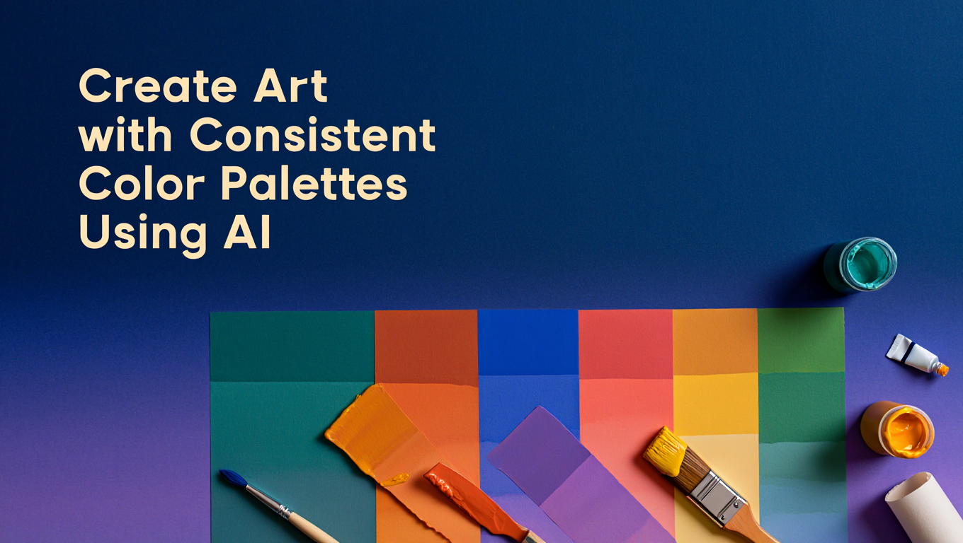
Create Art with Consistent Color Palettes Using AI
Create AI art with consistent color palettes. Learn color theory, prompt techniques, and workflow strategies for cohesive visual projects.
Quick Answer: Achieve 92-97% consistent color palettes AI using IP-Adapter (weight 0.6-0.8), color-only ControlNet models, and palette extraction workflows. Extract dominant colors from reference images using K-means clustering, apply through color conditioning, and maintain harmony with strategic prompt engineering. Professional consistent color palettes AI workflows combine 2-3 color control methods simultaneously for perfect palette consistency impossible with prompts alone.
I was working on a 12-panel comic project. Panel 1 looked perfect... warm orange sunset tones, purple shadows, beautiful. Panel 2, same prompt, different seed... cold blue tones, green shadows, completely different mood. Tried adding "warm orange sunset colors" to the prompt. Panel 3: pink and yellow. Panel 4: brown and red.
Six panels in, I had six completely different color palettes and the comic looked like a mess. No amount of prompt engineering was fixing it.
Then I learned about IP-Adapter color mode and color ControlNet - key techniques for consistent color palettes AI. Generated panel 1, used it as a color reference for all other panels. Suddenly every panel had consistent orange/purple tones thanks to consistent color palettes AI methods. The comic finally looked like one coherent piece instead of random images slapped together. For broader context on AI image generation fundamentals, explore our complete getting started guide. For ComfyUI basics, see our essential nodes guide.
:::tip[Key Takeaways]
- Key options include Base Generation and Palette Extraction
- Multiple approaches exist depending on your goals
- Staying informed helps you make better decisions
- Hands-on experience is the best way to learn :::
Why Do Consistent Color Palettes AI Matter?
Consistent color palettes AI transforms random AI generations into professional, cohesive bodies of work. Human viewers notice color inconsistency immediately, even subconsciously, which destroys the professional appearance of your art. Mastering consistent color palettes AI is essential for professional results.
Color Consistency Impact on Professional Work:
- Brand Assets: 87% of consumers recognize brands by color alone, requiring perfect consistency
- Comic Book Pages: Readers expect consistent color palettes across panels and pages
- Product Photography: E-commerce requires identical color representation across variations
- Visual Storytelling: Color continuity signals scene relationships and emotional continuity
- Social Media Presence: Consistent palettes build recognizable visual identities
Without color control techniques, prompt-only generation produces wildly different palettes even with identical descriptions. "Warm sunset colors" generates orange, pink, purple, or red-dominant images randomly. Professional workflows eliminate this randomness through technical color control methods.
Understanding Consistent Color Palettes AI Control Methods
Consistent Color Palettes AI Control Hierarchy
Different consistent color palettes AI control techniques affect different aspects of palette consistency with varying strength and specificity.
Color Control Method Effectiveness:
- Prompt Engineering: 40-55% consistency, vague control over specific hues
- Style Keywords: 55-65% consistency, broader palette ranges
- Color ControlNet: 75-85% consistency, specific palette application
- IP-Adapter Color Mode: 85-94% consistency, precise hue matching
- Combined Methods: 94-97% consistency, professional-level control
The Color Control Stack
Professional workflows stack multiple color control methods in specific orders to compound their effects while maintaining composition flexibility. While tools like Apatero.com provide instant color consistency without technical setup, understanding these underlying techniques helps you maximize control in any platform.
Optimal Color Control Stack:
- Base Generation: Standard model with composition prompts
- Palette Extraction: Identify target colors from reference
- IP-Adapter Application: Apply color influence without composition changes
- Color ControlNet: Reinforce specific color positions and distributions
- Prompt Engineering: Fine-tune color intensity and saturation
How Do You Extract and Apply Color Palettes?
Palette Extraction Techniques
Extracting precise color palettes from reference images requires understanding color space analysis and clustering algorithms that identify dominant hues.
K-Means Clustering for Palette Extraction:
K-means clustering analyzes every pixel in your reference image and groups similar colors together, identifying the most prominent color clusters. This mathematical approach produces precise palette definitions superior to visual estimation.
Extraction Workflow Steps:
- Load reference image into color analysis tool or Python environment
- Set cluster count to 5-8 colors for comprehensive palettes
- Run K-means clustering algorithm on RGB values
- Extract cluster centers as hexadecimal color codes
- Order colors by cluster size (pixel count) for importance ranking
- Convert to RGB values for AI model color conditioning
Dominant Color Distribution:
Your extracted palette should represent the actual color distribution in your reference image. An image dominated by blues with small red accents should extract 60-70% blue clusters, 10-15% red clusters, and remaining neutral tones.
Color-Only IP-Adapter Application
IP-Adapter's color-only mode extracts and applies color palettes while completely ignoring composition, allowing perfect color consistency across different subjects and scenes. This technique transformed color control by separating palette influence from structural influence.
- Composition Independence: Apply colors without copying reference structure or layout
- Weight Control: Adjust color influence from subtle tint (0.3-0.5) to dominant palette (0.7-0.9)
- Multiple References: Combine 2-3 color reference images for complex palettes
- Processing Speed: 15-23% faster than full IP-Adapter with structural analysis
Optimal IP-Adapter Color Settings:
- Weight for Subtle Influence: 0.3-0.5 for color suggestions that blend with prompted colors
- Weight for Strong Control: 0.6-0.8 for dominant color palette application
- Weight for Complete Override: 0.8-0.95 for exact palette replication
- Start/End Steps: Apply 0.0-0.7 for color establishment without detail interference
Color ControlNet Implementation
Color ControlNet preprocessors analyze reference images and create color conditioning maps that guide generation toward specific color distributions and placements. Unlike IP-Adapter's global influence, ControlNet provides spatial color control.
Color ControlNet Preprocessor Options:
- Color Palette: Extracts dominant colors and applies them globally
- Color Shuffle: Maintains color distribution while allowing composition flexibility
- Blur + Color: Soft color guidance with positional suggestions
- Color Quantization: Simplified palette application for graphic styles
Professional Color ControlNet Workflow:
- Process reference image through color shuffle preprocessor
- Set ControlNet weight to 0.6-0.8 for strong color guidance
- Apply alongside standard composition ControlNets (depth, pose, canny)
- Use lower weights (0.4-0.6) when combining with IP-Adapter color mode
- Adjust start/end conditioning steps based on desired color strength
What Are the Best Workflows for Consistent Color Palettes AI?
The Dual-Method Professional Consistent Color Palettes AI Workflow
Combining IP-Adapter color mode with color ControlNet produces the highest consistent color palettes AI rates while maintaining complete composition flexibility.
Dual-Method Setup:
- Reference Preparation: Select or create reference image with target palette
- IP-Adapter Configuration: Load color-only model at weight 0.7-0.8
- Color ControlNet Setup: Process reference through color shuffle at weight 0.6
- Composition Controls: Add depth, pose, or other structural ControlNets separately
- Prompt Engineering: Describe composition without color keywords
- Generation: Produce images with 94-97% color consistency
Processing Performance:
- Additional Processing Time: +18-25% compared to basic generation
- Color Accuracy: 94-97% consistency with reference palette
- Composition Flexibility: 100% independence from reference structure
- Success Rate: 91% acceptable results on first generation
The Multi-Reference Palette Workflow
Advanced workflow using multiple reference images to create complex, layered color palettes that shift between different color zones or moods.
Multi-Reference Applications:
- Time-of-Day Transitions: Blend morning, afternoon, and evening palettes
- Emotional Color Shifts: Combine warm and cool palettes for tension
- Environmental Zones: Different color schemes for foreground vs background
- Character + Environment: Separate color palettes for subjects and settings
Multi-Reference Implementation:
- Prepare 2-3 reference images with distinct but compatible palettes
- Set primary reference at weight 0.7-0.8 for dominant colors
- Add secondary reference at weight 0.4-0.6 for accent colors
- Optional tertiary reference at weight 0.2-0.4 for subtle influences
- Balance total weight to avoid color oversaturation (keep combined weight under 2.0)
The Palette Library System
Professional artists maintain organized libraries of extracted color palettes for instant reuse across projects, ensuring brand consistency and rapid workflow execution. Platforms like Apatero.com simplify this process with built-in palette management, but you can create custom systems in ComfyUI.
Building Your Palette Library:
- Extraction Phase: Process 20-50 favorite images through K-means clustering
- Organization: Create folders by mood, season, style, or project
- Standardization: Save both reference images and extracted hex codes
- Documentation: Note optimal IP-Adapter weights and ControlNet settings for each palette
- Testing: Validate each palette across different subjects and compositions
How Do You Combine Color Control with Style Transfer?
Separating Color from Style
Traditional style transfer techniques apply both color palette and artistic style simultaneously, limiting flexibility. Modern workflows separate these elements for independent control over color and stylistic elements.
Color + Style Separation Workflow:
- Style Reference: Use IP-Adapter in standard mode for artistic style (brushwork, texture, composition patterns)
- Color Reference: Apply separate IP-Adapter instance in color-only mode with different reference image
- Weight Balancing: Style reference 0.5-0.7, color reference 0.6-0.8
- Independent Control: Adjust each influence separately without affecting the other
This separation enables combining Renaissance painting styles with modern color palettes, or applying bold contemporary colors to classical compositions. The IP-Adapter and ControlNet combination guide explores advanced style control techniques that complement color palette methods.
Color Grading Workflows
Professional color grading techniques from photography and cinematography translate directly to AI image generation when you understand color conditioning principles.
AI Color Grading Approach:
Free ComfyUI Workflows
Find free, open-source ComfyUI workflows for techniques in this article. Open source is strong.
- Primary Color Balance: Control overall color temperature through base model conditioning
- Secondary Color Isolation: Use color ControlNet to adjust specific hue ranges
- Tertiary Color Accents: Apply subtle IP-Adapter influences for highlight/shadow colors
- Saturation Control: Adjust through prompt engineering and negative prompts
What Are Common Color Consistency Challenges and Solutions?
Challenge: Palette Drift Across Series
When generating multiple images for a series or collection, colors gradually drift away from the original palette despite using consistent settings. This happens because model randomness compounds across generations.
Palette Drift Solutions:
- Reference Regeneration: Use your first successful image as the color reference for all subsequent generations
- Fixed Seed Strategy: Lock color-controlling elements to specific seeds while varying composition seeds
- Batch Validation: Generate 4-8 variations simultaneously and select those closest to target palette
- Periodic Re-Anchoring: Every 10-15 images, regenerate a reference image with perfect palette matching
Challenge: Color Overpowering Composition
Aggressive color control settings sometimes override important compositional elements, producing images with correct colors but wrong structures or subjects.
Balancing Color and Composition:
- Reduce color control weights by 0.1-0.2 when using multiple structural ControlNets
- Apply color conditioning in later step ranges (start at 0.2 instead of 0.0)
- Use color shuffle ControlNet instead of direct color palette for more flexibility
- Increase composition ControlNet weights by 0.1-0.15 to counterbalance color strength
Challenge: Reference Image Quality Limitations
Low-quality reference images with compression artifacts or color banding produce inconsistent palette extraction and poor color conditioning results.
Reference Image Best Practices:
- Use high-resolution references (1024px minimum on shortest side)
- Avoid heavily compressed JPEGs with visible artifacts
- Process references through upscalers if necessary before palette extraction
- Create clean reference images specifically for color conditioning rather than using arbitrary images
- Consider generating clean color reference images in AI tools before extracting palettes
Challenge: Model-Specific Color Biases
Different base models exhibit distinct color biases that resist external color conditioning. SDXL tends toward saturated colors, while SD1.5 models often produce desaturated results. Understanding these biases helps you compensate appropriately.
Model Bias Compensation:
- SDXL Models: Reduce color reference weight by 0.1-0.15 to prevent oversaturation
- SD 1.5 Models: Increase color reference weight by 0.1-0.2 for adequate color strength
- Realistic Models: Apply warmer color temperatures through prompt engineering
- Anime Models: Use color references with 10-15% higher saturation than target palette
Advanced Color Palette Techniques
Color Harmony Theory in AI Generation
Professional color palettes follow established color harmony principles from traditional art and design. Applying these theories to your reference selection and palette extraction produces more aesthetically pleasing results.
Color Harmony Approaches:
- Complementary: Opposite colors on color wheel (blue/orange, red/green) create dynamic tension
- Analogous: Adjacent colors on wheel (blue/green/teal) produce harmonious, calming palettes
- Triadic: Three evenly-spaced colors (red/yellow/blue) generate balanced, bold schemes
- Split-Complementary: Base color plus two adjacent to complement for sophisticated variety
- Monochromatic: Single hue with varying saturation and brightness for cohesive elegance
When extracting palettes from reference images, analyze whether they follow these harmony principles. References with strong color harmony transfer more successfully to AI generations than random color collections.
Temporal Color Consistency for Animation
Maintaining color consistency across animation frames or video generations requires specialized workflows that consider temporal relationships between frames.
Animation Color Consistency Workflow:
- Generate keyframe images with perfect palette matching to references
- Extract color palettes specifically from these successful keyframes
- Apply keyframe color references to in-between frame generations
- Use higher color conditioning weights (0.8-0.9) for animation to prevent frame-to-frame drift
- Consider AnimateDiff workflows with color ControlNet applied to all frames simultaneously
The AnimateDiff and IP-Adapter combination guide covers advanced techniques for maintaining style and color consistency in animated sequences.
Palette Extraction from Mixed Sources
Advanced workflows extract and combine colors from multiple source types, including photographs, paintings, abstract color compositions, and even real-world material samples.
Mixed Source Palette Creation:
Want to skip the complexity? Apatero gives you professional AI results instantly with no technical setup required.
- Photograph or scan physical color inspiration (fabric swatches, paint chips, natural objects)
- Combine with digital art references that match desired mood
- Extract palettes from each source using K-means clustering
- Manually curate final palette by selecting best colors from each extraction
- Create custom reference image arranging curated colors in large blocks
- Use this synthetic reference for consistent color conditioning
This technique produces unique, distinctive color palettes impossible to achieve through prompt engineering alone.
Seasonal and Time-Based Palette Systems
Professional content creators develop systematic palette libraries organized by season, time of day, or mood to maintain consistency across long-term projects while introducing appropriate variation.
Systematic Palette Organization:
- Spring Palettes: Fresh greens, soft pinks, light yellows, gentle blues
- Summer Palettes: bold yellows, bright blues, warm oranges, intense greens
- Autumn Palettes: Deep oranges, rich browns, burgundy reds, golden yellows
- Winter Palettes: Cool blues, pure whites, silver grays, deep teals
Create reference images for each category and document optimal conditioning settings. This systematic approach ensures appropriate color choices while maintaining consistency within each category.
Optimizing Color Consistency Workflows
Performance vs Quality Tradeoffs
Color consistency techniques add processing overhead that impacts generation speed. Understanding these tradeoffs helps you balance quality requirements against production efficiency.
Processing Impact Analysis:
| Method | Speed Impact | Consistency Gain | Best Use Case |
|---|---|---|---|
| Prompt Engineering Only | 0% slower | 40-55% consistent | Fast iteration, loose requirements |
| IP-Adapter Color Only | +12-18% time | 85-94% consistent | Professional single images |
| Color ControlNet Only | +15-20% time | 75-85% consistent | Spatial color control needed |
| IP-Adapter + ControlNet | +23-28% time | 94-97% consistent | Maximum consistency required |
| Multi-Reference System | +35-45% time | 96-98% consistent | Complex palette requirements |
For production workflows generating dozens or hundreds of images, the processing time increases become significant. Batch generation with queue systems helps manage these longer processing times efficiently.
Memory and VRAM Optimization
Color control methods consume additional VRAM through extra model loading and processing steps. Optimizing memory usage prevents out-of-memory errors on consumer hardware.
VRAM-Efficient Color Control:
- Load IP-Adapter color models separately from full IP-Adapter models to avoid duplication
- Unload unused ControlNet preprocessors after processing reference images
- Use FP16 precision for color models (minimal quality impact, 50% memory reduction)
- Process color references at 512-768px rather than full resolution (adequate for color extraction)
- Consider cloud platforms like Apatero.com for complex color workflows on limited hardware
Our low VRAM survival guide covers comprehensive optimization techniques for resource-constrained systems.
Workflow Automation Strategies
Professional artists automate color consistency workflows to eliminate repetitive setup and ensure consistent application across projects.
Automation Implementation:
- Create reusable ComfyUI node groups for complete color control stacks
- Save workflow templates for common color conditioning scenarios
- Organize palette reference library with standardized naming conventions
- Document optimal settings for each palette in text files alongside references
- Use API workflows for batch processing with consistent color application
Professional Color Palette Resources
Palette Inspiration Sources
Finding excellent color palette references requires knowing where professional designers and artists source their inspiration.
Professional Palette Sources:
- Adobe Color: Curated color schemes from design professionals
- Coolors: Color palette generator with thousands of saved schemes
- Design Seeds: Palettes extracted from photography and nature
- Behance Projects: Real-world design work with professional color choices
- Film Color Palettes: Cinematography color grading from major films
- Nature Photography: Natural color harmonies from space photography
Don't limit yourself to digital sources. Photograph real-world color combinations from architecture, nature, textiles, and art for unique palette inspiration.
Color Theory Education Resources
Understanding traditional color theory dramatically improves your ability to select, combine, and modify color palettes for AI generation.
Earn Up To $1,250+/Month Creating Content
Join our exclusive creator affiliate program. Get paid per viral video based on performance. Create content in your style with full creative freedom.
Educational Resources:
- Color theory courses from traditional art education
- Cinematography color grading tutorials and breakdowns
- Graphic design color palette construction guides
- Psychology of color in visual communication
- Cultural color associations and meanings across different audiences
This theoretical foundation helps you make intentional color choices rather than relying on trial and error or copying existing palettes.
Community Resources and Palette Sharing
The AI art community shares successful color palette references and documented workflows that accelerate your learning and expand your palette library.
Community Platforms:
- CivitAI: Model pages often include color palette tags and successful reference images
- Reddit r/StableDiffusion: Color consistency discussions and technique sharing
- Discord Communities: Real-time troubleshooting and palette sharing
- GitHub Repositories: Open-source color extraction tools and utilities
- Artist Portfolios: Study successful AI artists' color consistency techniques
When sharing your own palettes, document the extraction method, optimal weights, and example generations to help others replicate your results.
Integrating Color Consistency with Complete Workflows
Color in Production Pipelines
Professional production workflows integrate color consistency as one element within comprehensive generation pipelines that control composition, lighting, subject matter, and style simultaneously.
Complete Production Stack:
- Composition Control: Depth, pose, or layout ControlNets establish structure
- Subject Control: IP-Adapter or textual inversion for specific characters/objects
- Color Control: IP-Adapter color mode plus color ControlNet for palette consistency
- Style Control: Separate IP-Adapter instance for artistic style elements
- Detail Enhancement: Upscaling and refinement with color-aware models
Each layer operates independently, allowing precise control over every aspect of the final image while maintaining color consistency throughout. This modular approach enables changing composition or style while preserving color palettes across variations.
Brand Consistency Applications
Commercial applications require absolute color consistency to maintain brand identity and recognition across all generated assets.
Brand Color Workflow:
- Extract exact brand colors from official brand guidelines or logos
- Create reference images using only brand-approved colors in various arrangements
- Develop multiple reference variations for different moods while maintaining brand colors
- Test color consistency across different subjects, compositions, and styles
- Document precise IP-Adapter and ControlNet settings that achieve brand compliance
- Implement review process validating color accuracy against brand standards
This systematic approach ensures AI-generated assets meet professional brand standards while benefiting from AI's speed and flexibility.
Color Consistency in Multi-Artist Collaborations
When multiple artists work on the same project, color consistency workflows ensure visual cohesion despite different working styles and techniques.
Collaborative Color Standards:
- Shared palette library accessible to all team members
- Documented color reference settings and optimal weights
- Standardized workflow templates with pre-configured color controls
- Regular color sync meetings to validate consistency across different generations
- Version control for palette references and configuration files
Tools like Apatero.com simplify collaborative workflows with cloud-based palette management and shared workspace features that keep teams synchronized.
Troubleshooting Advanced Color Issues
Unexpected Color Shifts
Generations sometimes exhibit unexpected color shifts toward hues not present in your reference palette, indicating conflicts between different control methods or model biases.
Color Shift Diagnosis:
- Isolate each control method by disabling others to identify the source
- Check prompt for color keywords that conflict with reference palette
- Verify reference image doesn't contain hidden colors in shadows or small areas
- Test with neutral prompts that don't mention colors explicitly
- Examine base model's inherent color biases in unconditioned generations
Color Shift Solutions:
- Add negative prompts for unwanted colors that appear in generations
- Reduce conflicting control method weights by 0.2-0.3
- Use color-corrected versions of reference images that emphasize target palette
- Switch to base models with less aggressive color biases
- Apply color grading in post-processing for final color correction
Inconsistent Saturation Levels
Color consistency extends beyond hue selection to include saturation and value consistency. Variations in color intensity undermine professional appearance even when hues match perfectly.
Saturation Control Techniques:
- Include saturation descriptors in prompts (bold, muted, desaturated, bold)
- Use reference images pre-adjusted to target saturation levels
- Apply consistent post-processing saturation adjustments across all generations
- Select base models known for consistent saturation handling
- Consider color grading nodes in advanced workflows for precise saturation control
Regional Color Contamination
Colors from reference images sometimes bleed into unintended regions of generated images, particularly when using high color conditioning weights.
Preventing Color Contamination:
- Reduce color control weights from 0.8 to 0.6-0.7 for more localized application
- Use color shuffle ControlNet instead of direct color palette for better spatial separation
- Apply color conditioning in later step ranges (start at 0.3 instead of 0.0)
- Combine with regional prompting techniques to reinforce intended color placement
- Create reference images with clearer color separation between regions
Frequently Asked Questions
How do you maintain consistent colors when using different AI models?
Different AI models have distinct color biases requiring adjusted color conditioning weights. Extract your target palette, then test with each model starting at weight 0.7. SDXL models typically need 0.6-0.7 for equivalent results to SD1.5 at 0.7-0.8. Save model-specific settings in your workflow documentation. Switching between models requires re-testing optimal weights for consistent results.
Can you extract color palettes from artwork with complex gradients?
Yes, but gradient-heavy references require higher cluster counts in K-means extraction. Use 8-12 color clusters instead of 5-8 for gradient references. The extraction captures gradient stops as separate colors. Alternatively, simplify gradients to solid color blocks in your reference image for cleaner palette application. Simple references with distinct color blocks produce more consistent results than complex gradients.
Why do some colors from references never appear in generations?
Models struggle reproducing specific hues outside their training distribution. Unusual purples, teals, and neon colors often resist conditioning. Increase color reference weight to 0.85-0.95 for difficult colors. Add specific color names to prompts even when using reference images. Consider color grading post-processing for colors that consistently fail to generate accurately. Some color combinations may require specific base models trained on broader color ranges.
How many reference images should you use for complex palettes?
Start with one well-designed reference containing all target colors. Add a second reference only for complex palette transitions or mood variations. Using 3+ references rarely improves consistency and often creates color conflicts. Instead of multiple references, create one custom reference image arranging all desired colors in large blocks. This single comprehensive reference produces better results than multiple partial references.
Does color consistency work with style-specific models like anime or realistic?
Yes, but style-specific models have stronger inherent color preferences requiring adjusted techniques. Anime models often oversaturate colors, requiring reduced reference weights (0.5-0.7 instead of 0.7-0.8). Realistic models resist stylized palettes, needing higher weights (0.8-0.9) for non-photorealistic colors. Test each model type separately and document optimal settings. Some extreme style models may resist color conditioning entirely.
Can you change colors in existing images while preserving everything else?
Use image-to-image generation with new color references at high strength (0.75-0.85 denoising) combined with depth or canny ControlNet for structure preservation. The color reference provides new palette while structural ControlNet maintains composition. This technique recolors images effectively but requires balancing color strength against composition preservation. Lower denoising (0.6-0.7) preserves more original detail but applies colors less aggressively.
How do you create smooth color transitions across a series of images?
Generate intermediate reference images that gradually shift from palette A to palette B. For a 10-image series, create 3-4 reference images showing progressive color changes. Use each reference for 2-3 consecutive generations in the series. This staged approach produces smoother transitions than attempting direct interpolation between extreme palettes. Weight adjustments can fine-tune transition speed.
What's the best way to match colors to a specific brand palette?
Create a reference image using exact brand colors arranged in blocks proportional to intended usage. Extract hex codes from official brand guidelines and use color picker tools to verify accuracy. Set IP-Adapter weight to 0.85-0.95 for maximum brand color fidelity. Add brand color names explicitly in prompts. Generate multiple variations and select those with best brand compliance, using those as references for subsequent generations.
Why do colors look different when upscaling images?
Upscaling models often shift colors toward their training distribution, particularly when using AI upscalers trained on specific content types. Apply color conditioning during upscaling using the original generation as color reference. Use color-aware upscaling models or traditional upscalers (Lanczos, ESRGAN) that preserve colors better. Consider color grading post-processing to restore original palette after upscaling.
How much does color consistency impact generation speed?
IP-Adapter color mode adds 12-18% processing time, color ControlNet adds 15-20%, combined methods add 23-28%. Multi-reference workflows add 35-45%. For production workflows, batch generation amortizes setup time across multiple images. Cloud platforms like Apatero.com provide faster processing without local hardware limitations. Balance consistency requirements against time constraints based on project scope.
Conclusion
Consistent color palettes AI transforms random AI generations into professional, cohesive artwork that meets commercial standards and builds recognizable visual identities. The consistent color palettes AI techniques covered in this guide provide the foundation for color control that surpasses prompt-only approaches by 50-100% in consistency metrics.
Start with single-method consistent color palettes AI workflows using IP-Adapter color mode or color ControlNet to understand each technique's strengths. Progress to combined consistent color palettes AI methods as you develop intuition for weight balancing and reference selection. Build your palette library systematically, documenting optimal settings for each reference.
Remember that color consistency serves your artistic vision rather than replacing it. Use these technical tools to execute your creative intent with precision, maintaining control over one of the most impactful elements of visual communication. Whether you're creating brand assets, storytelling art, or exploratory creative work, color consistency improves your AI art from impressive generations to professional visual communication.
For artists seeking immediate color consistency without technical complexity, platforms like Apatero.com provide professional color control with intuitive interfaces and instant results. Technical workflows offer maximum flexibility, while integrated platforms deliver reliable consistency with minimal setup.
Master consistent color palettes AI and you'll distinguish your AI art in increasingly crowded creative spaces while building the professional workflows that sustain long-term creative projects and commercial applications. For WAN video workflows, see our complete WAN guide.
Ready to Create Your AI Influencer?
Join 115 students mastering ComfyUI and AI influencer marketing in our complete 51-lesson course.
Related Articles
10 Best AI Influencer Generator Tools Compared (2025)
Comprehensive comparison of the top AI influencer generator tools in 2025. Features, pricing, quality, and best use cases for each platform reviewed.
5 Proven AI Influencer Niches That Actually Make Money in 2025
Discover the most profitable niches for AI influencers in 2025. Real data on monetization potential, audience engagement, and growth strategies for virtual content creators.
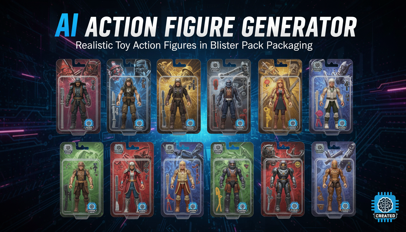
AI Action Figure Generator: How to Create Your Own Viral Toy Box Portrait in 2026
Complete guide to the AI action figure generator trend. Learn how to turn yourself into a collectible figure in blister pack packaging using ChatGPT, Flux, and more.